Product development of My Pages - a self-service portal for debtors
Client: Alektum Group | Role: UX-designer | Duration: 2023-2025
Background
My Pages is Myntro’s (Alektum Group) self-service portal for debtors across multiple European markets. When I joined the project, the portal had been largely neglected for years, confusing to navigate, inaccessible, and offering little beyond basic payment. Internally, it had been under criticism for a long time. My role was to lead the UX work to transform it into a modern, trustworthy, and usable product.
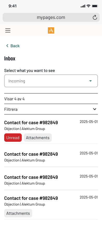
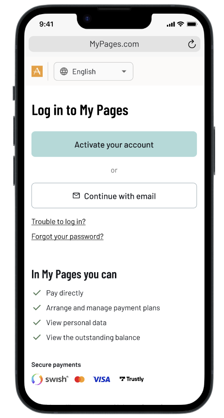
These screenshots show the state of My Pages before the redesign. Each screen reflects a common pattern: information presented for the system, not for the person trying to use it.
Payment plan - manual month selection, no affordability guidance
Case overview - flat list, no prioritisation
Case detail - data table with no clear next step
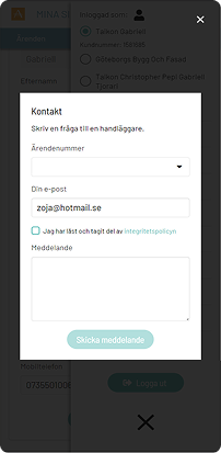
Contact form - buried, no case context visible
The challenge
Designing under unique constraints
Designing for people in debt comes with unique constraints. Due to legal and integrity reasons, we were not allowed to conduct direct interviews with debtors. Instead I worked closely with case handlers who interact with debtors daily, while staying critical of the operational bias that naturally comes with that perspective. We compensated by triangulating insights across multiple sources: observations, support patterns, and operational data. Despite not being able to speak directly with debtors, the evidence was clear. The existing portal reflected years of incremental additions, functional in parts, but never designed around the person using it.
Designing the new My Pages was an iterative process and the first mobile-friendly product where we would apply our newly built design system. My Pages had historically been built with desktop users in mind, but when we looked at the data, the picture was clear: the majority of users were accessing the portal on mobile. This mismatch between assumption and reality became one of the driving forces behind the redesign.
Beyond the research constraints, we structured our work around three overall goals:
- Simplify user flows based on user goals rather than system logic
- Improve usability and accessibility across all touchpoints
- Design a scalable experience that could adapt across European markets

Establishing a foundation
In need of a design system
Early on, I identified inconsistencies across Alektum Group’s products both in visual design and interaction patterns. This resulted in a less good user experience, slower development, and challenges in ensuring compliance with WCAG accessibility standards.
At the same time, upgrading the frontend from Vue 2 to Vue 3 was a high priority. Our developer lead strongly advocated for a “latest is greatest” approach, creating momentum for technical modernization. I positioned this as a strategic opportunity, not just to update the tech stack, but to align design, development, and business needs into a more cohesive foundation.
I took an active role in driving this alignment. I worked across disciplines to connect perspectives and build momentum for introducing a design system. I facilitated workshops with the marketing team, the key stakeholders responsible for brand ownership, to define a shared visual direction. In parallel, I led discussions with developers and managers to ensure the solution supported both technical scalability and product needs. I also presented the initiative to the entire IT department to create broader understanding and buy-in.
By bridging business, technology, and user experience, I helped move the organization toward a shared vision — establishing a design system that improved consistency, increased development efficiency, and created a scalable, accessible foundation for future products.
From design system workshop - Working with colors
From design system workshop - Testing color combinations
For a deeper dive into my work with the design system, see the

understanding the organisation
Envisioning the experience of paying your debt
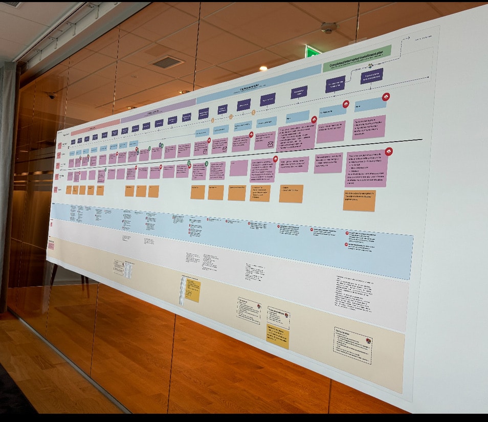
As a Service design strategic initiative at Alektum Group, I developed a comprehensive Service blueprint to visualize and improve the full debtor journey across digital and human touchpoints.
The project aimed to clarify and streamline the service delivery for two distinct user paths: debtors contacting handlers via phone and those interacting through the self-service portal (MyPages). By mapping these flows side-by-side, I was able to expose inconsistencies in the experience and highlight systemic breakdowns, especially in high-friction areas such as interrupted payment plans.
Research & Discovery:
To ground the blueprint in real operations, I conducted field research including shadowing case managers, call monitoring, and stakeholder interviews. One critical insight emerged around the “Afterlife” of payment plans, when debtors default but don’t restart or complete the process. By mapping this with underlying backstage processes (like the call list used by handlers), we were able to visualize hidden complexity and design better interventions.
Co-Creation & Alignment
To activate the blueprint, I co-facilitated a full-day workshop with stakeholders from product, IT, and operations. The blueprint served as a:
- Shared artifact for cross-team understanding.
- Conversation starter to surface blind spots and ownership gaps.
- Foundation for ideation, where teams generated role-specific ideas to improve the service.
Rather than focusing only on UX/UI, I ensured the group considered backstage systems, organizational silos, and communication flows.
Outcomes:
✅ Organizational Alignment: Brought together siloed teams under a shared service vision.✅ Strategic Roadmap: Helped prioritize UX and operational improvements.✅ Cultural Shift: Introduced service design thinking into ongoing product development.✅ Improved Resilience: Highlighted where service breaks down when plans are interrupted, a key area of debtor default.
This blueprint not only became a tool for prioritization and planning, but also a cultural shift toward more holistic, user-centered service thinking within the organization.
Research approach
To ground the work in real-world behavior, I conducted extensive field research. Due to integrity and legal constraints, I was not able to interview debtors directly. Instead, I worked closely with case handlers and their managers, who interact with debtors on a daily basis.
I observed how case handlers managed payment plans and handled their “afterlife”, including follow-ups, interruptions, and cancellations to understand routines, decision-making, and underlying reasoning. In parallel, I conducted interviews with both case handlers and managers to capture their perspectives, operational logic, and key metrics.
To complement this, I facilitated a series of co-creative workshops where we collaboratively mapped the user journey and created service blueprints. This was a highly iterative process, involving multiple sessions, continuous dialogue, and refinement over time.
Co-Creation & Alignment
To bring the service blueprint to life, I co-facilitated a full-day workshop with key stakeholders from Product, IT, and Operations. The blueprint acted as more than just a visual map, it became a shared reference point that aligned teams around the current state of the service.
It sparked valuable conversations, helping us uncover blind spots, clarify responsibilities, and bridge gaps in ownership. Most importantly, it laid the groundwork for ideation: participants worked in role-based groups to generate actionable ideas for improving the service from their specific perspectives.
The blueprint served as a:
- Shared artifact for cross-team understanding.
- Conversation starter to surface blind spots and ownership gaps.
- Foundation for ideation, Highlighted where service breaks down when plans are interrupted, a key area of debtor default.
The following chapter captures moments from the workshop and illustrates how the blueprint shaped our shared understanding and collaboration moving forward.
Challenges & learnings
To ground the blueprint in real operations, I conducted field research including observing, interviewing and cooperative workshops. One critical insight emerged around the “Afterlife” of payment plans, when debtors default but don’t restart or complete the process. By mapping this with underlying backstage processes (like the call list used by handlers), we were able to visualize hidden complexity and design better interventions.
- Maintained direct communication with Aktiv Delgivning, gathering additional insights into business needs.
- Identified key pain points across user groups, such as:
- Clients: Lack of visibility into their cases and inefficient communication.
- Administrators: Outdated product features and internal processes causing delays.
- Service men: Inadequate tools for managing deliveries in the field.
Key insights
Through research, several patterns emerged that highlighted gaps in both the user experience and operational processes.
1. The experience pushes users toward support instead of self-service
- Information is currently prioritized to drive users to contact Operations rather than helping them resolve issues independently
- Debtors lack clear guidance and incentives to take action early, leading to missed first payments
2. Lack of transparency creates uncertainty and inaction
- There is little to no information about the consequences of not taking action
- No confirmation is sent when a payment plan is completed or terminated
- Debtors cannot easily request confirmations or documentation
3. Communication is slow, manual, and outdated
- Physical letters are still a primary channel, causing delays (e.g. several days, no weekend handling)
- Reminders require manual assessment, leading to inefficiencies and missed payments
- Follow-ups for broken payment plans are handled inconsistently and can sometimes increase the debtor’s burden rather than help resolve it
4. High operational complexity impacts both UX and development
- Payment plans are heavily influenced by client-specific requirements, which vary across creditors and countries
- There is no unified system to handle these variations, leading to increased code complexity
- The user experience differs depending on the underlying client agreement and case status
5. Lack of automation creates unnecessary friction
- There is no automatic termination of inactive payment plans
- Many processes rely on manual handling, increasing workload and reducing consistency

Designing the new My Pages experience
Designing the new state of My Pages was an iterative process and and which was the first mobile-friendly product where we would apply our new design system. In addition to the above, we focused on three overall areas we wanted to achieve:
- Simplifying user flows depending on user-goal
- To increase the usability aspects
- Designing for a scalable experience across markets.
Redesigning the application was an iterative process where we tested many different ways to visualize the information we thought was most important to the user (the Debtors). It was of course challenging that we were not allowed to talk directly to the user, but we had close contact with the people who actually talked to them. The caseworkers.
To expand our perspective, we conducted an extensive external analysis, drawing inspiration from established digital products such as Blocket, Airbnb, and Klarna. Rather than copying patterns, we explored and adapted interaction models and ways of structuring information that could fit our specific context.
Throughout the process, we conducted evaluative testing with case handlers and managers across multiple European markets. This helped us identify common needs and behaviors, allowing us to design for a broader audience rather than creating fragmented, market-specific solutions.
1
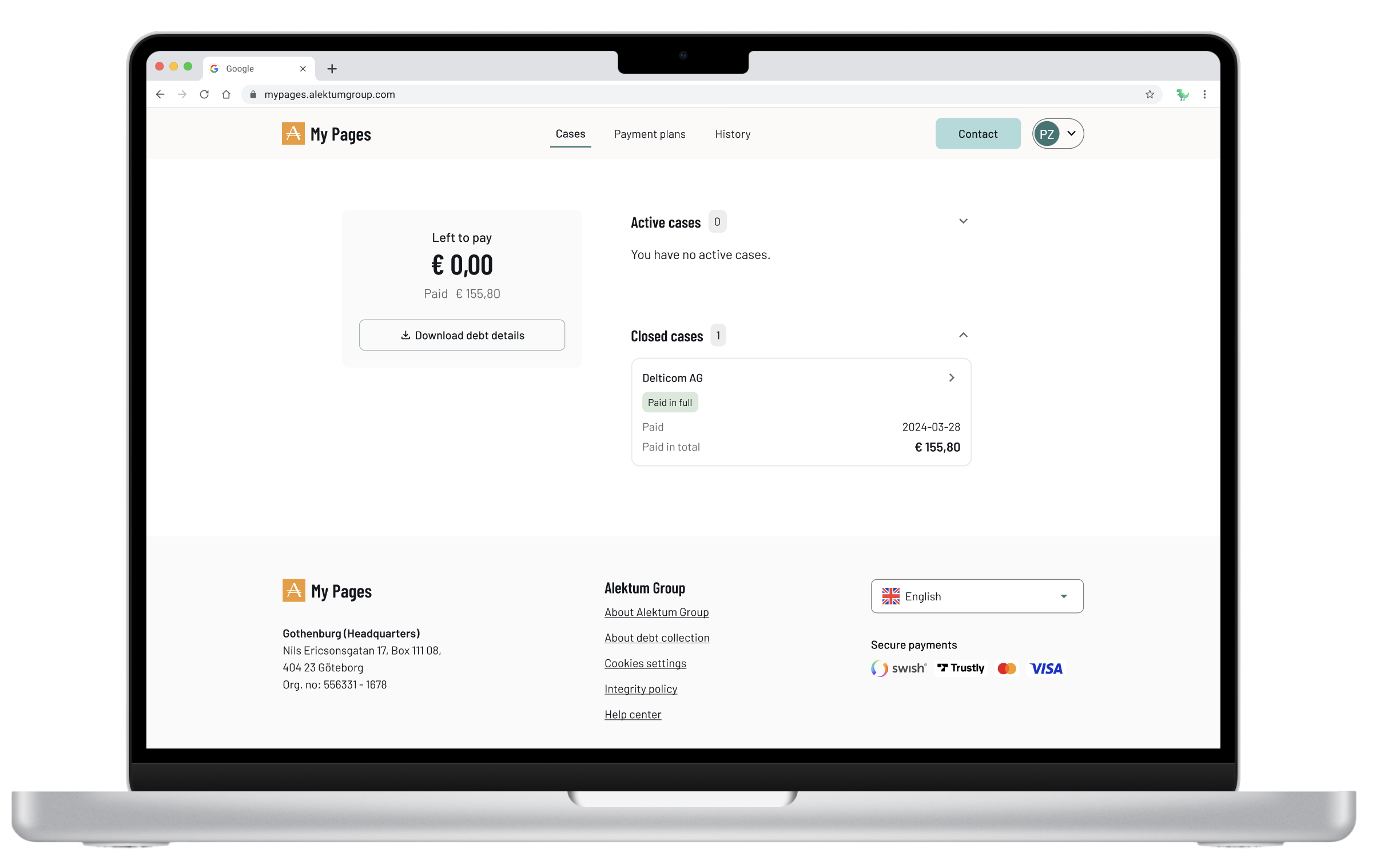
Landing page
The landing page serves as the main entry point, including case information, payment status, and quick actions.
Redesigned layout using components from our new design system
Streamlined content to surface the most critical information first: total debt, active payment plan
Restructured hierarchy top-down so users immediately understand their situation
Introduced clear status indicators so users always know their next step
Added log in possibility after payed debt. Working as a reciept, showing closed cases that has been paid in full.
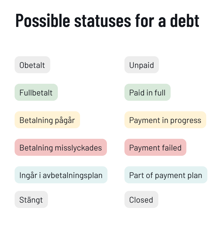
New statuses
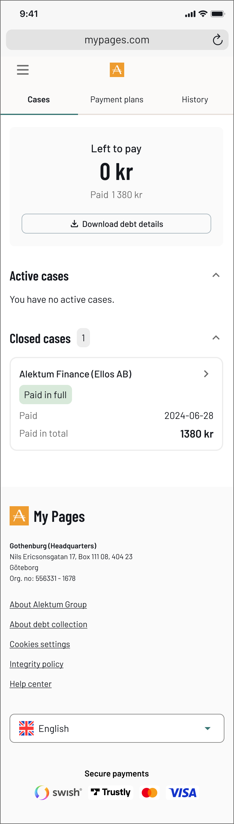
New - Closed cases
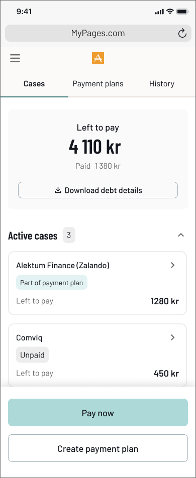
New - Landing page
Old - Landing page
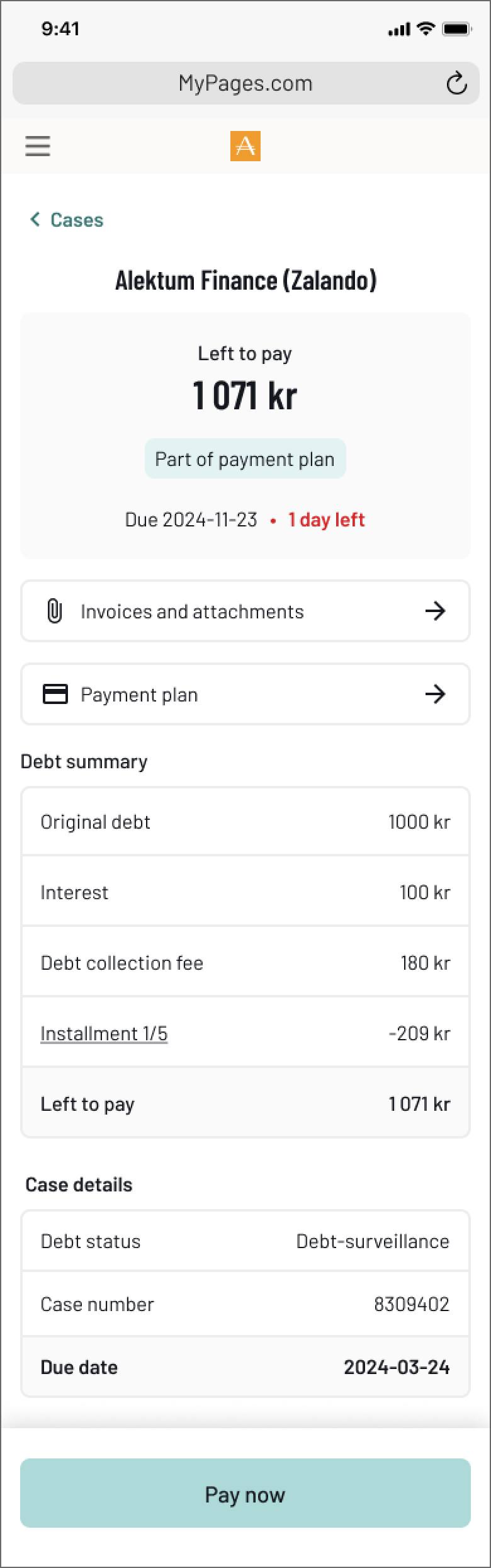
2
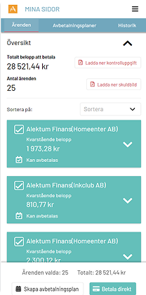
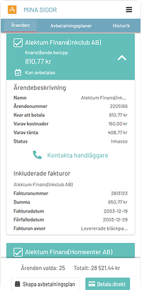
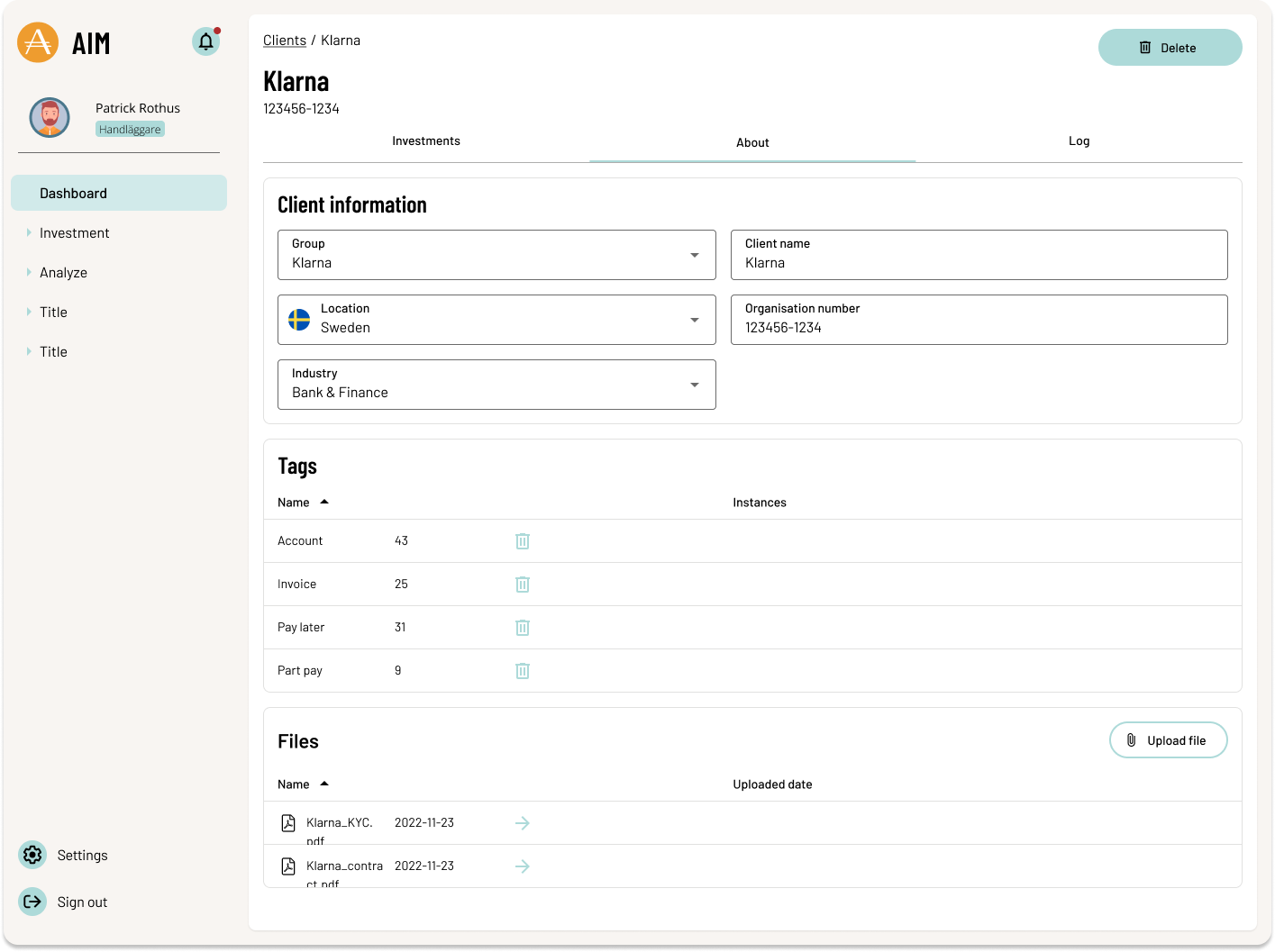
Case details
The old portal expanded case details inline, a pattern that worked for simple information but held us back from adding anything more. Moving to a dedicated page created a scalable design where new features could be added where they made sense.
Moved from inline expansion to a dedicated detail page, creating a scalable design
Restructured the debt breakdown to be readable at a glance, not a raw data table
Added direct access to invoices and attachments as a new feature, surfaced contextually
Kept payment actions visible and persistent throughout the page
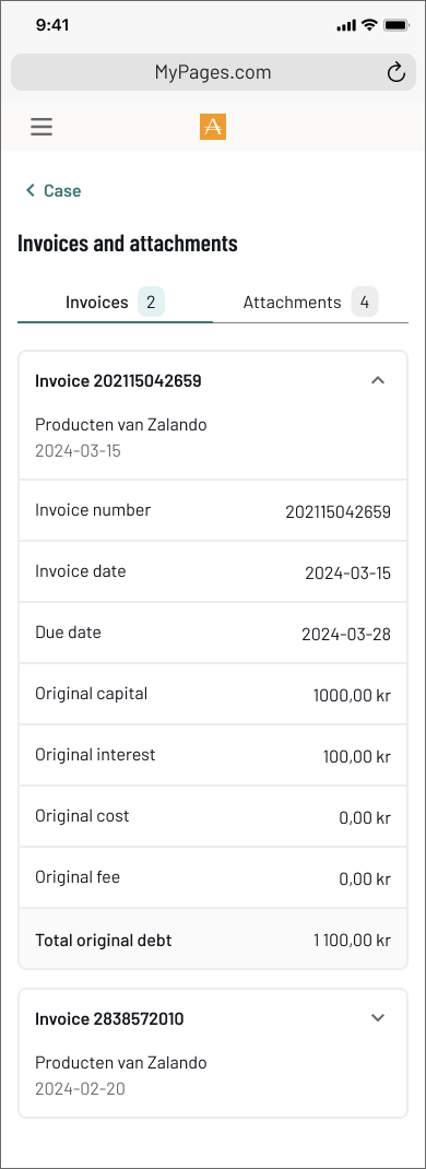
New - Invoice and attachments
Scrolling ↓
New - Case details
Old - Case details
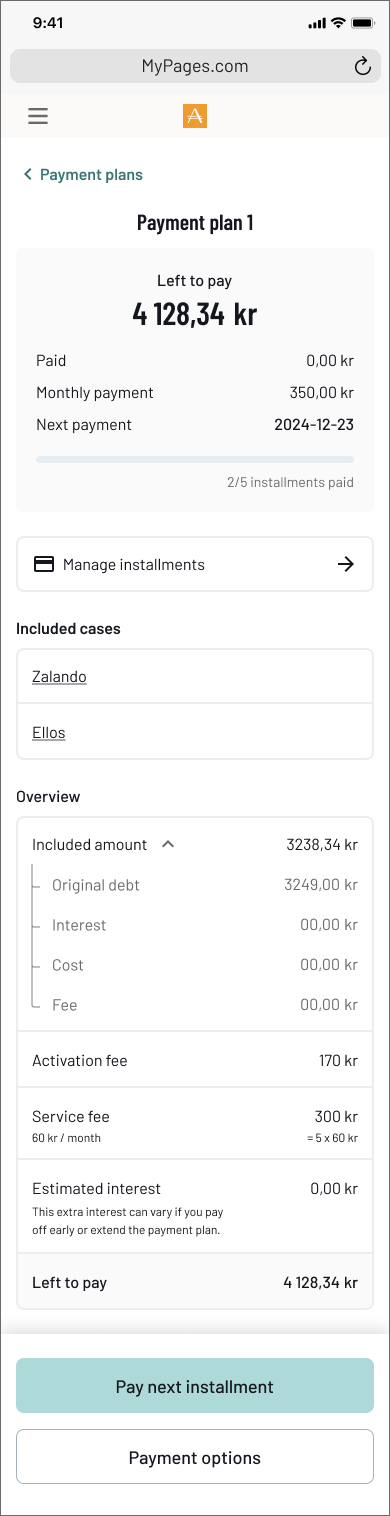
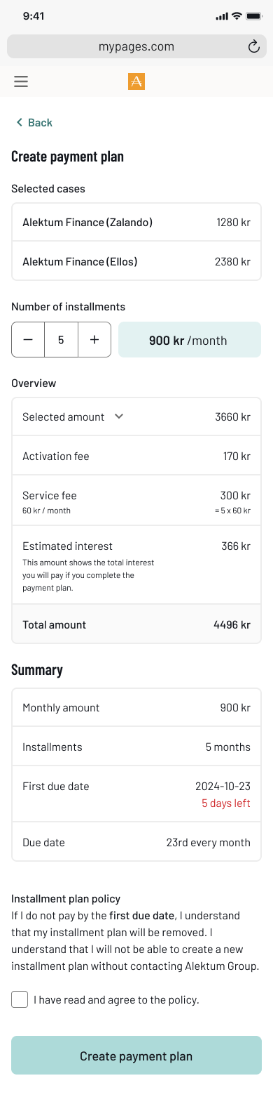
3
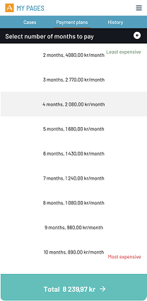
Payment plans
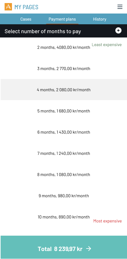
The old flow asked users to pick a number of months from a plain list, all they could see was the monthly cost. The new flow makes the full picture visible before the user commits.
Replaced the raw month selector with a +/- stepper that updates costs in real time
Showed the full cost breakdown upfront, activation fee, service fee, estimated interest, total
Added a clear summary so users know exactly what they are committing to
Built a dedicated plan detail page showing progress, next payment date, and included cases
Added log in possibility after payed debt. Working as a reciept, showing closed cases that has been paid in full.
Scrolling ↓
New - Payment plan overview
Scrolling ↓
New - Create payment plan
Old - Create payment plan
4
Payment plans
Many users contacted case handlers with questions that could be answered independently. There was no self-service option in the old portal at all.
Designed and developed an integrated help centre with searchable, localised content across all markets
Organised topics around user questions, not internal system categories
Added popular topics as quick-access chips to reduce time to answer
Linked help articles contextually from within cases and payment flows
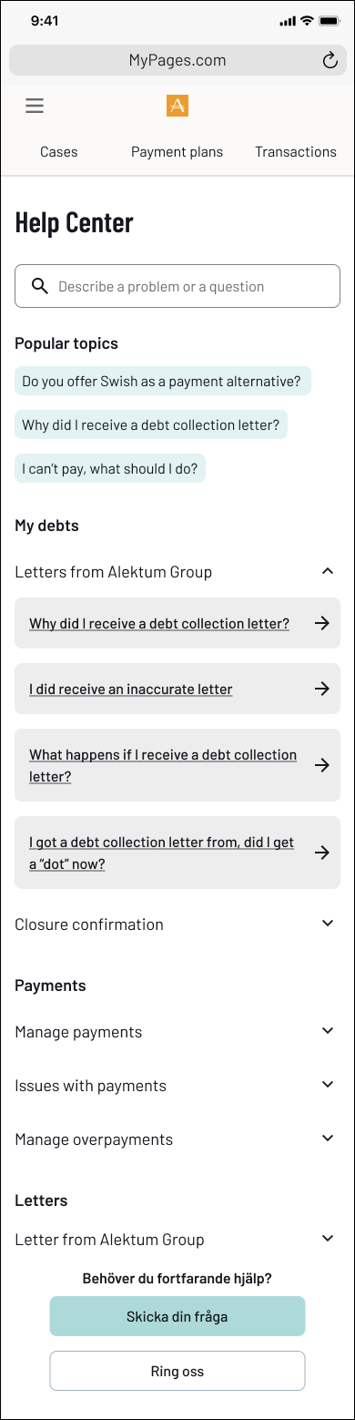
New feature - Help center
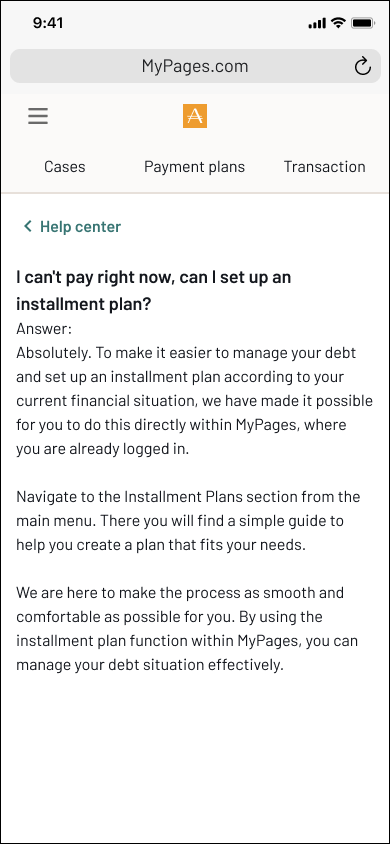
Help center - Answer to a FAQ
5
Improved communication
Before the redesign, all communication happened over email, a critical security problem. There was no reliable way to verify that the person on the other end was actually the debtor. The new system moved all communication inside the authenticated portal, solving the identity problem entirely.
Moved all communication inside the authenticated portal, messages are now tied to a verified identity
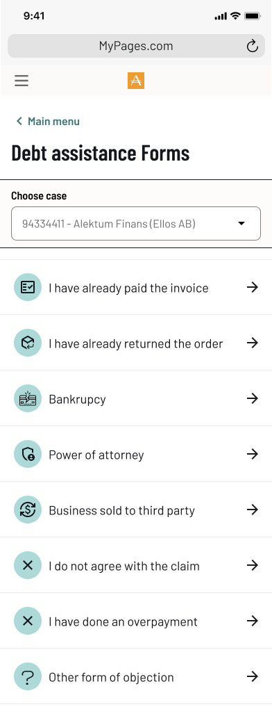
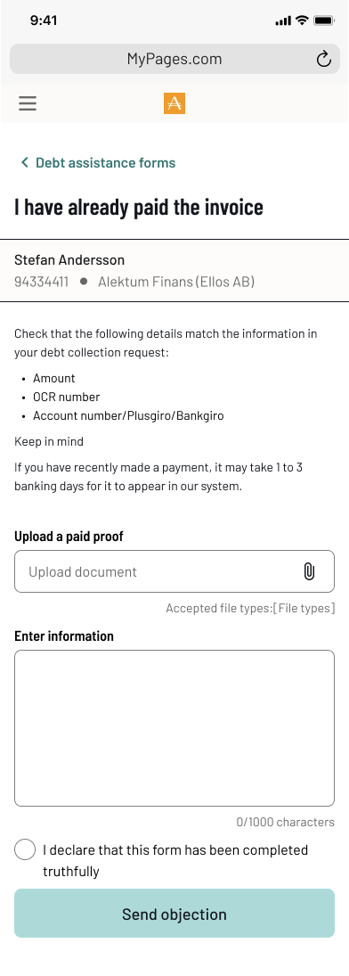
Replaced the generic contact form with categorised debt assistance forms
Built a dedicated inbox so users can track and respond to case handler messages in context
Added document upload directly within forms, removing the need for email attachments
Structured the conversation view so both parties can see the full history of a case
New feature - Help center
Help center - Answer to a FAQ
Help center - Answer to a FAQ
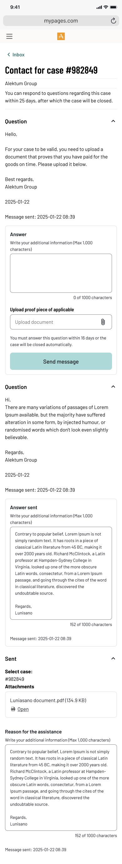
Improving debtor-handler communication in a secure self-service portal
Problem statement
The My Pages portal lacked a secure and effective way for debtors to communicate with handlers. The open-ended form offered no guidance, resulting in messages that were often vague or incomplete. This led to critical information gaps, forced follow-ups via unsecured email, and made proper identity validation difficult, introducing serious GDPR risks. The unclear flow not only hindered resolution times but also missed opportunities to engage users meaningfully at a sensitive point in their journey.
Old communication modal
Mapping the problem to design the solution
To drive meaningful change, I first visualized the full communication flow as it existed. This chart exposed inefficiencies and compliance risks, aligning the team around a shared understanding of what needed fixing — and why.
Envisioning a better communication flow
This future-state flow illustrates a streamlined, secure, and structured communication process. Designed to reduce back-and-forth, minimize compliance risks, and empower users, it laid the groundwork for aligning cross-functional teams around a shared goal.
Process
To address these issues, I initiated and led a UX investigation focusing on:
- Business problem mapping: I identified pain points through internal analysis and discussions with stakeholders. Such as, Handlers from the operational staff and IT.
- Cross-functional collaboration: I worked closely with handlers in the operations team to understand real-world communication challenges.
- Technical scoping: I prepared and facilitated workshops with backend and frontend developers to assess feasibility, complexity, and potential solutions.
- User journey redesign: I mapped the current and envisioned future communication flows to support secure, structured, and complete interactions within the portal.


Evolving ways of working
During my time at Alektum Group, the product organization went through significant changes. Initially, development was largely project-based and followed a more waterfall-oriented approach. This meant working in isolated initiatives, with limited visibility into the product as a whole or how it evolved over time.
Coming from an agile background, I found it challenging to adapt to this way of working. Even after transitioning toward a product-driven organization, there was still a lack of shared practices and experience in how to effectively work in a more modern, iterative way.
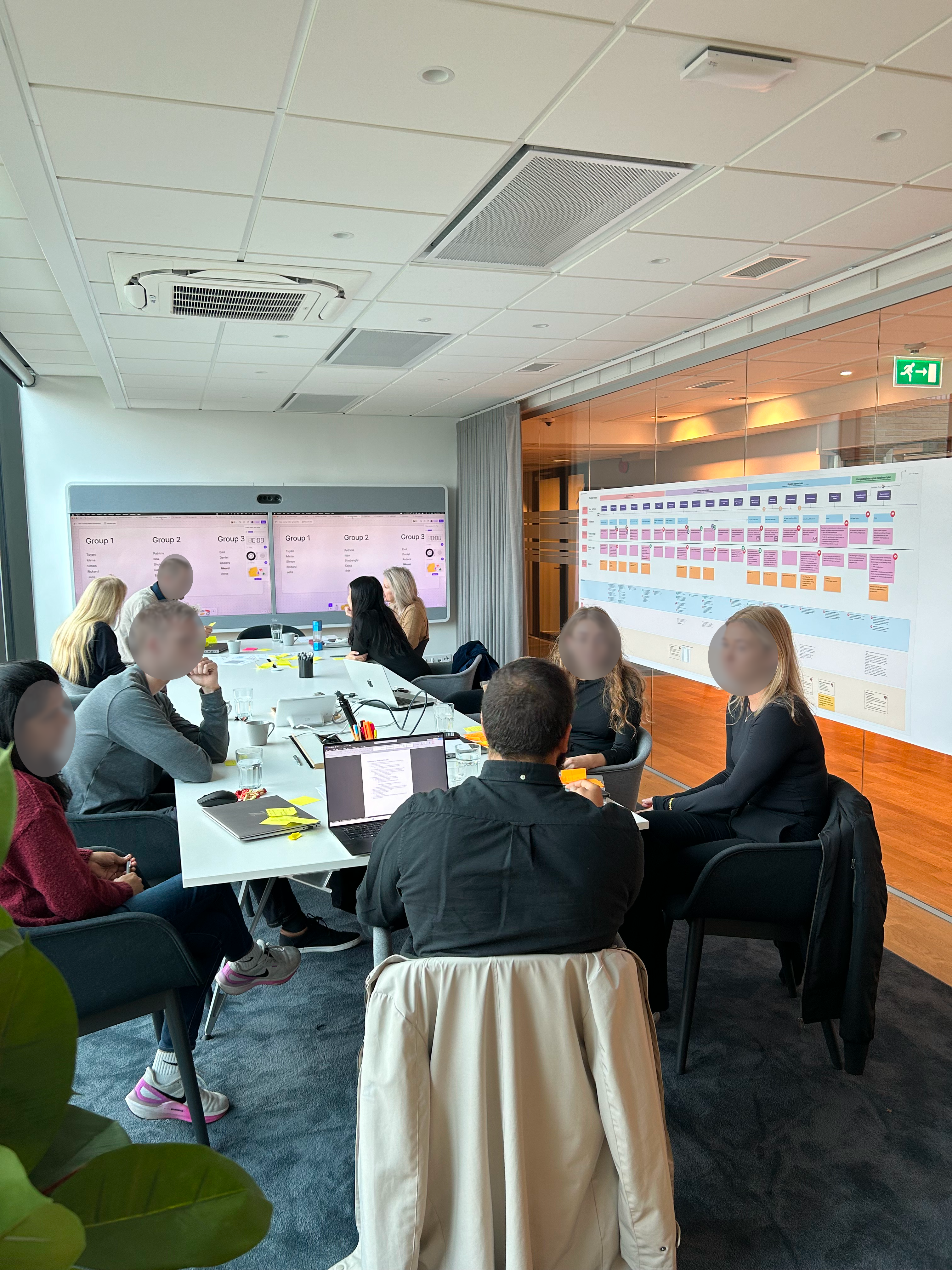
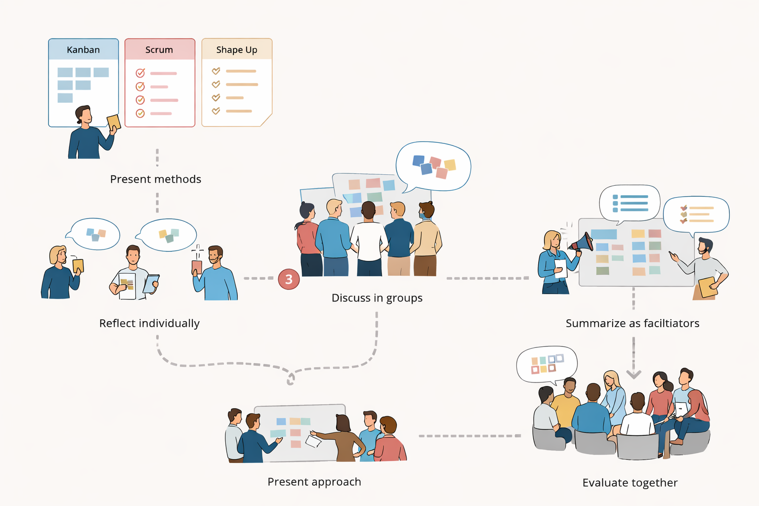
Recognizing this gap, I took initiative together with another designer to help shape a better approach. We introduced agile principles and worked actively to create alignment across roles and teams.
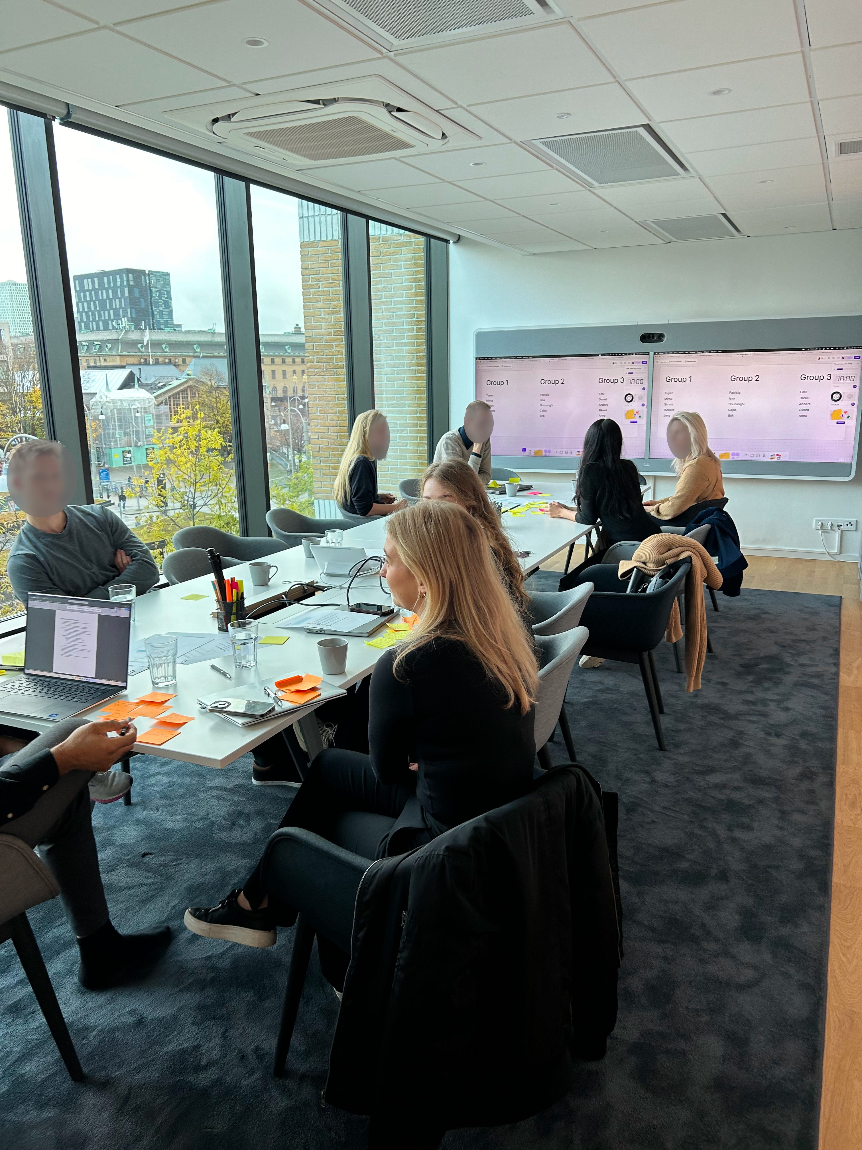
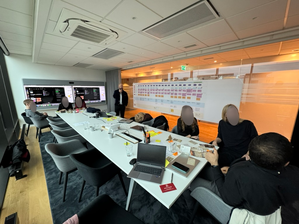
To support this, I initiated and co-facilitated a series of agile workshops, bringing together developers, designers, product owners, and operations. During these sessions, we presented and explored different ways of working — including Kanban, Scrum, and Shape Up. The teams were then encouraged to collaboratively shape their own approach by combining elements from each method.
We recognized that different teams had different needs, and rather than enforcing a single framework, we focused on creating a flexible structure that teams could adapt and take ownership of.
Impact
- Increased cross-team visibility into what we’re working on and why
- Faster iteration cycles, with less time lost in handoffs or waiting
- Better balance between planned work and unexpected changes
- A process that feels owned by the team, not imposed on them
The workshop process
Impact
- Increased cross-team visibility into what we’re working on and why
- Faster iteration cycles, with less time lost in handoffs or waiting
- Better balance between planned work and unexpected changes
- A process that feels owned by the team, not imposed on them
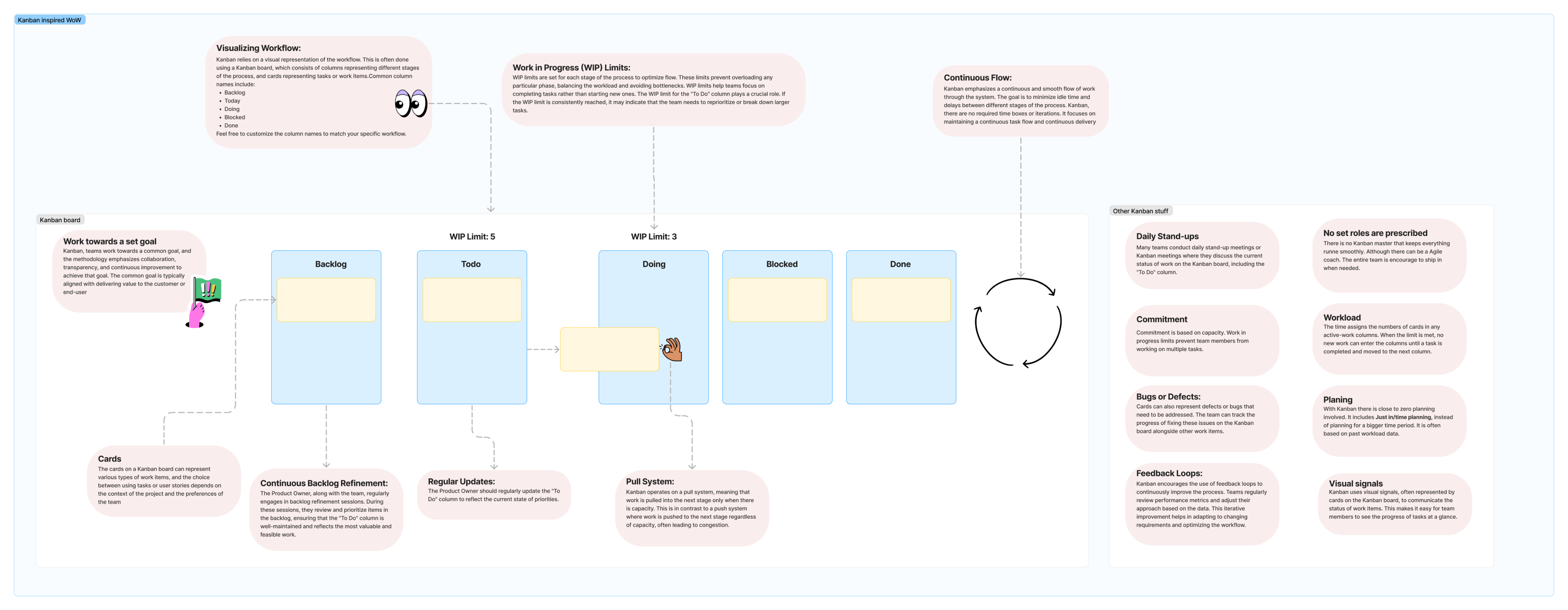
Kanban - enabling a flexible design flow
Kanban is a visual workflow method used to manage tasks and track progress continuously. We used it to support an iterative design process, allowing us to stay flexible, reprioritize quickly, and refine solutions as new insights emerged.
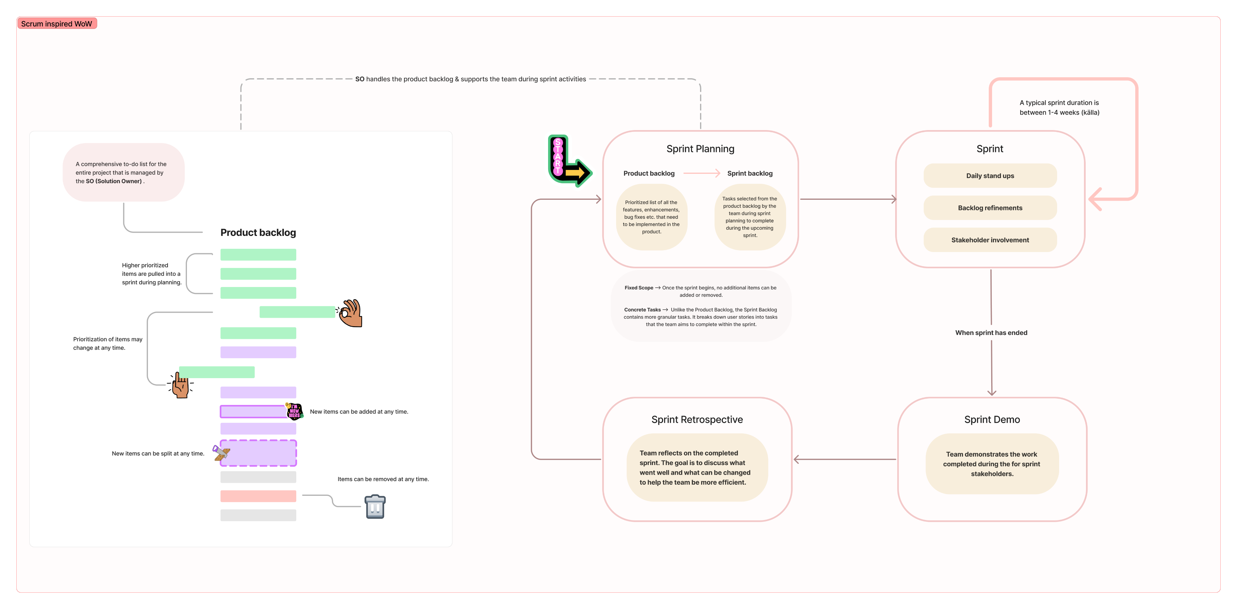
Scrum - providing structure and alignment
Scrum is a structured framework for planning and delivering work in cycles. We used it to create alignment with the broader team, ensuring regular planning, feedback, and a shared direction throughout the project.
Coordinating a Scalable International Rollout
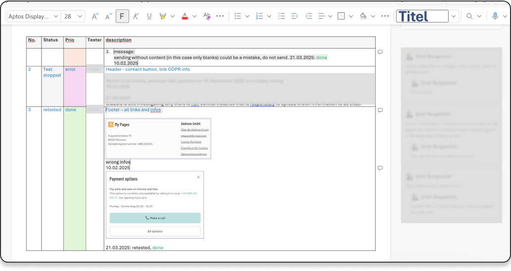
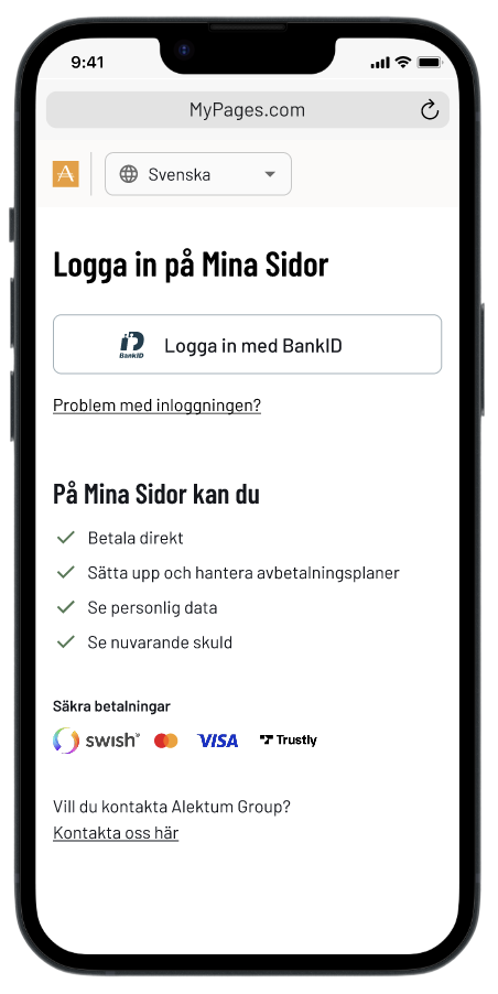
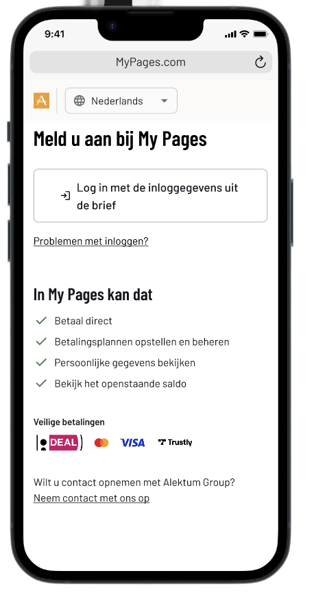
Led the international rollout of our self-service portal, coordinating country-specific adaptations across all Alektum markets. I worked closely with assigned testers in each country to ensure the portal met local needs, managing translations, ensuring regulatory compliance, and adapting to differences in user behavior, such as customizing login methods to regional preferences and technical requirements.
To support this process, I created a detailed test document tailored to each market. It included step-by-step instructions and checkpoints aligned with local variations. A snippet of this document is shown below.
Led the international rollout of our self-service portal, coordinating country-specific adaptations across all Alektum markets. I worked closely with assigned testers in each country to ensure the portal met local needs—managing translations, ensuring regulatory compliance, and adapting to differences in user behavior, such as customizing login methods to regional preferences and technical requirements.
To support this process, I created a detailed test document tailored to each market. It included step-by-step instructions and checkpoints aligned with local variations.
Want to know more?


Redesign of My pages, UX/UI fokus
Client: Myntro (Alektum Group)
Role
UX-designer

Type
Product lifecycle
development
Team
2 designers, 4 developers,
1 Product Manager

Timeline
Jan - Apr 2026
Skills
UX/UI design, System Design,
Service design
Background
My Pages is Myntro’s (Alektum Group) self-service portal for debtors across multiple European markets. When I joined the project, the portal had been largely neglected for years, confusing to navigate, inaccessible, and offering little beyond basic payment. Internally, it had been under criticism for a long time. My role was to lead the UX work to transform it into a modern, trustworthy, and usable product.
These screenshots show the state of My Pages before the redesign. Each screen reflects a common pattern: information presented for the system, not for the person trying to use it.
Case overview - flat list, no prioritisation
Payment plan - manual month selection, no affordability guidance
Case detail - data table with no clear next step
Contact form - buried, no case context visible
The challenge
Designing under unique constraints
Designing for people in debt comes with unique constraints. Due to legal and integrity reasons, we were not allowed to conduct direct interviews with debtors. Instead I worked closely with case handlers who interact with debtors daily, while staying critical of the operational bias that naturally comes with that perspective. We compensated by triangulating insights across multiple sources: observations, support patterns, and operational data. Despite not being able to speak directly with debtors, the evidence was clear. The existing portal reflected years of incremental additions, functional in parts, but never designed around the person using it.
Designing the new My Pages was an iterative process and the first mobile-friendly product where we would apply our newly built design system. My Pages had historically been built with desktop users in mind, but when we looked at the data, the picture was clear: the majority of users were accessing the portal on mobile. This mismatch between assumption and reality became one of the driving forces behind the redesign.
Beyond the research constraints, we structured our work around three overall goals:
- Simplify user flows based on user goals rather than system logic
- Improve usability and accessibility across all touchpoints
- Design a scalable experience that could adapt across European markets

Establishing a foundation
In need of a design system
Early on, I identified inconsistencies across Myntros (Alektum Group) products both in visual design and interaction patterns. This resulted in a less good user experience, slower development, and challenges in ensuring compliance with WCAG accessibility standards.
I took an active role in driving this alignment. I worked across disciplines to connect perspectives and build momentum for introducing a design system. I facilitated workshops with the marketing team, the key stakeholders responsible for brand ownership, to define a shared visual direction. In parallel, I led discussions with developers and managers to ensure the solution supported both technical scalability and all product needs. I also presented and educated the entire IT department about a design system to create broader understanding and buy-in.
At the same time, upgrading the frontend from Vue 2 to Vue 3 was a high priority. Our developer lead strongly advocated for a “latest is greatest” approach, creating momentum for technical modernization. I positioned this as a strategic opportunity, not just to update the tech stack, but to align design, development, and business needs into a more cohesive foundation.
By bridging business, technology, and user experience, I helped move the organization toward a shared vision, establishing a design system that improved consistency, increased development efficiency, and created a scalable, accessible foundation for future products.
From design system workshop - Testing color combinations
From design system workshop - Working with colors
For a deeper dive into my work with the design system, see the

understanding the organisation
Envisioning the experience of paying your debt
As part of shaping the future state of a debtors experience of debt collection, I was tasked with exploring and designing key parts of the user journey from a more holistic and forward-looking perspective.
I began with the payment plan journey, one of the most critical and complex flows. This included the entire experience, from the moment a user receives a letter (physically or via a digital mailbox like Kivra), through setting up and managing a payment plan, to either completing it or discontinuing it.
Research approach
Due to integrity and legal constraints, I was not allowed to interview debtors directly. Instead, I worked closely with case handlers and their managers, who interact with debtors on a daily basis.
I observed how case handlers managed payment plans and handled their “afterlife”, including follow-ups, interruptions, and cancellations to understand routines, decision-making, and underlying reasoning. In parallel, I conducted interviews with both case handlers and managers to capture their perspectives, operational logic, and key metrics.
To complement this, I facilitated a series of co-creative workshops where we collaboratively mapped the user journey and designed service blueprints. This was a highly iterative process, involving multiple sessions, continuous dialogue, and refinement over time.
Co-Creation & Alignment
To bring the service blueprint to life, I co-facilitated a full-day workshop with key stakeholders from Product, IT, and Operations. The blueprint acted as more than just a visual map, it became a shared reference point that aligned teams around the current state of the service.
It sparked valuable conversations, helping us uncover blind spots, clarify responsibilities, and bridge gaps in ownership. Most importantly, it laid the groundwork for ideation: participants worked in role-based groups to generate actionable ideas for improving the service from their specific perspectives.
The blueprint served as a:
- Shared artifact for cross-team understanding.
- Conversation starter to surface blind spots and ownership gaps.
- Foundation for ideation, Highlighted where service breaks down when plans are interrupted, a key area of debtor default.
The following chapter captures moments from the workshop and illustrates how the blueprint shaped our shared understanding and collaboration moving forward.
Challenges & learnings
One of the key challenges during this phase was navigating organizational sensitivity. The level of exploration sometimes surfaced inefficiencies in existing routines, which could be difficult for stakeholders to engage with.
To address this, I focused on building trust and framing insights as opportunities for improvement rather than criticism. This helped create a more constructive dialogue and ensured that the work could move forward with stronger alignment.
Key insights
Through research, several patterns emerged that highlighted gaps in both the user experience and operational processes.
1. The experience pushes users toward support instead of self-service
- Information is currently prioritized to drive users to contact Operations rather than helping them resolve issues independently
- Debtors lack clear guidance and incentives to take action early, leading to missed first payments
2. Lack of transparency creates uncertainty and inaction
- There is little to no information about the consequences of not taking action
- No confirmation is sent when a payment plan is completed or terminated
- Debtors cannot easily request confirmations or documentation
3. Communication is slow, manual, and outdated
- Physical letters are still a primary channel, causing delays (e.g. several days, no weekend handling)
- Reminders require manual assessment, leading to inefficiencies and missed payments
- Follow-ups for broken payment plans are handled inconsistently and can sometimes increase the debtor’s burden rather than help resolve it
4. High operational complexity impacts both UX and development
- Payment plans are heavily influenced by client-specific requirements, which vary across creditors and countries
- There is no unified system to handle these variations, leading to increased code complexity
- The user experience differs depending on the underlying client agreement and case status
5. Lack of automation creates unnecessary friction
- There is no automatic termination of inactive payment plans
- Many processes rely on manual handling, increasing workload and reducing consistency
Designing the new My Pages experience
Designing the new state of My Pages was an iterative process and and which was the first mobile-friendly product where we would apply our new design system. In addition to the above, we focused on three overall areas we wanted to achieve:
- Simplifying user flows depending on user-goal
- To increase the usability aspects
- Designing for a scalable experience across markets.
Redesigning the application was an iterative process where we tested many different ways to visualize the information we thought was most important to the user (the Debtors). It was of course challenging that we were not allowed to talk directly to the user, but we had close contact with the people who actually talked to them. The caseworkers. Throughout the process, we conducted evaluative testing with case handlers and managers across multiple European markets. This helped us identify common needs and behaviors, allowing us to design for a broader audience rather than creating fragmented, market-specific solutions.
1
Landing page
The landing page serves as the main entry point, including case information, payment status, and quick actions.
Redesigned layout using components from our new design system
Streamlined content to surface the most critical information first: total debt, active payment plan
Restructured hierarchy top-down so users immediately understand their situation
Introduced clear status indicators so users always know their next step
Added log in possibility after payed debt. Working as a reciept, showing closed cases that has been paid in full.
Old - Landing page
New - Landing page
New - Closed cases
New statuses
2
Case details
The old portal expanded case details inline, a pattern that worked for simple information but held us back from adding anything more. Moving to a dedicated page created a scalable design where new features could be added where they made sense.
Moved from inline expansion to a dedicated detail page, creating a scalable design
Restructured the debt breakdown to be readable at a glance, not a raw data table
Added direct access to invoices and attachments as a new feature, surfaced contextually
Kept payment actions visible and persistent throughout the page
Old - Case details
Scrolling ↓
New - Case details
New - Invoice and attachments
3
Payment plans
The old flow asked users to pick a number of months from a plain list, all they could see was the monthly cost. The new flow makes the full picture visible before the user commits.
Replaced the raw month selector with a +/- stepper that updates costs in real time
Showed the full cost breakdown upfront, activation fee, service fee, estimated interest, total
Added a clear summary so users know exactly what they are committing to
Built a dedicated plan detail page showing progress, next payment date, and included cases
Added log in possibility after payed debt. Working as a reciept, showing closed cases that has been paid in full.
Old - Create payment plan
Scrolling ↓
New - Create payment plan
Scrolling ↓
New - Payment plan overview
4
Payment plans
Many users contacted case handlers with questions that could be answered independently. There was no self-service option in the old portal at all.
Designed and developed an integrated help centre with searchable, localised content across all markets
Organised topics around user questions, not internal system categories
Added popular topics as quick-access chips to reduce time to answer
Linked help articles contextually from within cases and payment flows
New feature - Help center
Help center - Answer to a FAQ
5
Improved communication
Before the redesign, all communication happened over email, a critical security problem. There was no reliable way to verify that the person on the other end was actually the debtor. The new system moved all communication inside the authenticated portal, solving the identity problem entirely.
Moved all communication inside the authenticated portal, messages are now tied to a verified identity
Replaced the generic contact form with categorised debt assistance forms
Built a dedicated inbox so users can track and respond to case handler messages in context
Added document upload directly within forms, removing the need for email attachments
Structured the conversation view so both parties can see the full history of a case
New feature - Help center
Help center - Answer to a FAQ
Help center - Answer to a FAQ
Help center - Answer to a FAQ
Improving debtor-handler communication in a secure self-service portal
Problem statement
The My Pages portal lacked a secure and effective way for debtors to communicate with handlers. The open-ended form offered no guidance, resulting in messages that were often vague or incomplete. This led to critical information gaps, forced follow-ups via unsecured email, and made proper identity validation difficult, introducing serious GDPR risks. The unclear flow not only hindered resolution times but also missed opportunities to engage users meaningfully at a sensitive point in their journey.
Old communication modal
Process
To address these issues, I initiated and led a UX investigation focusing on:
- Business problem mapping: I identified pain points through internal analysis and discussions with stakeholders. Such as, Handlers from the operational staff and IT.
- Cross-functional collaboration: I worked closely with handlers in the operations team to understand real-world communication challenges.
- Technical scoping: I prepared and facilitated workshops with backend and frontend developers to assess feasibility, complexity, and potential solutions.
- User journey redesign: I mapped the current and envisioned future communication flows to support secure, structured, and complete interactions within the portal.
Mapping the problem to design the solution
To drive meaningful change, I first visualized the full communication flow as it existed. This chart exposed inefficiencies and compliance risks, aligning the team around a shared understanding of what needed fixing — and why.
Envisioning a better communication flow
This future-state flow illustrates a streamlined, secure, and structured communication process. Designed to reduce back-and-forth, minimize compliance risks, and empower users, it laid the groundwork for aligning cross-functional teams around a shared goal.


Evolving ways of working
During my time at Alektum Group, the product organization went through significant changes. Initially, development was largely project-based and followed a more waterfall-oriented approach. This meant working in isolated initiatives, with limited visibility into the product as a whole or how it evolved over time.
Coming from an agile background, I found it challenging to adapt to this way of working. Even after transitioning toward a product-driven organization, there was still a lack of shared practices and experience in how to effectively work in a more modern, iterative way.
Recognizing this gap, I took initiative together with another designer to help shape a better approach. We introduced agile principles and worked actively to create alignment across roles and teams.
To support this, I initiated and co-facilitated a series of agile workshops, bringing together developers, designers, product owners, and operations. During these sessions, we presented and explored different ways of working, including Kanban, Scrum, and Shape Up. The teams were then encouraged to collaboratively shape their own approach by combining elements from each method.
We recognized that different teams had different needs, and rather than enforcing a single framework, we focused on creating a flexible structure that teams could adapt and take ownership of.
The workshop process
Impact
- Increased cross-team visibility into what we’re working on and why
- Faster iteration cycles, with less time lost in handoffs or waiting
- Better balance between planned work and unexpected changes
- A process that feels owned by the team, not imposed on them
Kanban - enabling a flexible design flow
Kanban is a visual workflow method used to manage tasks and track progress continuously. We used it to support an iterative design process, allowing us to stay flexible, reprioritize quickly, and refine solutions as new insights emerged.
Scrum - providing structure and alignment
Scrum is a structured framework for planning and delivering work in cycles. We used it to create alignment with the broader team, ensuring regular planning, feedback, and a shared direction throughout the project.
Coordinating a Scalable International Rollout
Led the international rollout of our self-service portal, coordinating country-specific adaptations across all Alektum markets. I worked closely with assigned testers in each country to ensure the portal met local needs, managing translations, ensuring regulatory compliance, and adapting to differences in user behavior, such as customizing login methods to regional preferences and technical requirements.
To support this process, I created a detailed test document tailored to each market. It included step-by-step instructions and checkpoints aligned with local variations. A snippet of this document is shown to the right.
Want to know more?

