Establishing design system at
Redesigned an entire web-application, aligned with our new design system, resulting in an accessible, more efficient, and scalable product.
Background
As a UX Designer at a medium large company, I worked on improving the experience for internal and external users across multiple products. I noticed inconsistencies in the UI and UX across our products, leading to insufficient usability, inefficiencies in development and maintenance. Additionally, as we introduced new features it became clear that a structured, scalable design approach was needed.
Challanges
- Inconsistent UI elements across different products
- Lack of reusable components, making UI design and development inefficient
- Design and development teams working in silos, leading to misalignment
- A need for better accessibility and usability standards for all external products
Process & Implementation
To address these challenges, me and my UX colleuges played a key role in implementing our design system:
Working with the marketing team
Since branding consistency was essential, we collaborated closely with marketing to ensure that color choices and visual identity aligned with their guidelines. We worked from the existing Alektum Group brandbook to match a color set that fit Alektum’s established look and feel. This helped gain their support and ensured a seamless experience across our self-service portal and external communications.
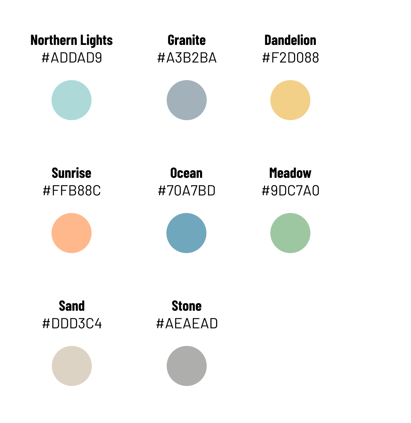
Alektum brand colors
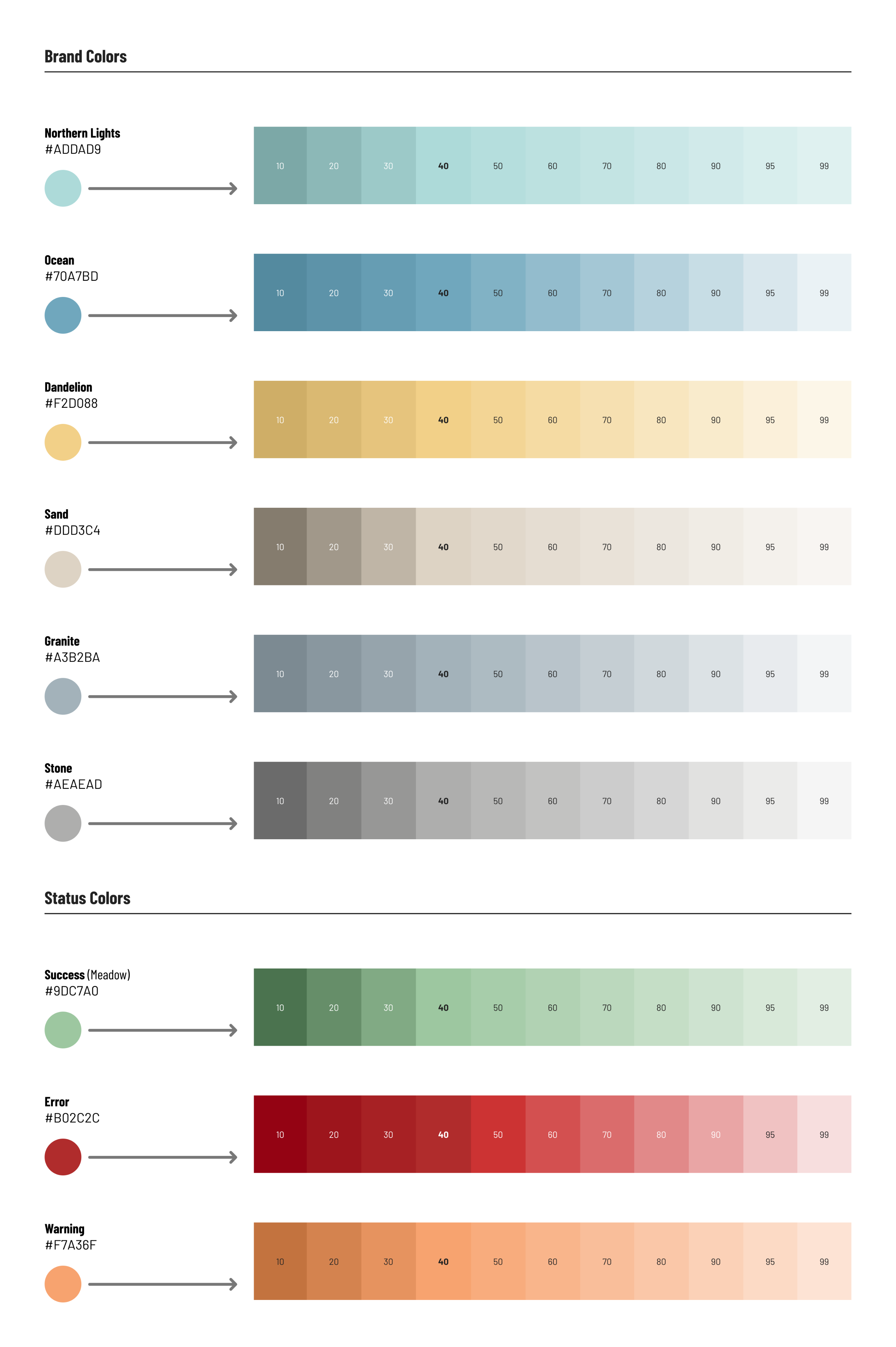
🎨 Building a Scalable Color SystemWe started with Alektum Group’s official brand colors and expanded them into a full scale, from shade 10 to 99. This gave us the flexibility to explore light and dark variants while staying true to the brand.
Alektum brand colors
🔴🟡🟢 Adding System Feedback To support user interactions, we introduced three basic status colors, keeping them functional yet aligned with the brand palette.
💬 Designing with EmotionFrom the brandbook, we were given a list of adjectives that define Alektum Group’s personality. These became our emotional design compass:
Flexible. Innovative. Knowledgeable. Quality-oriented. Helpful. Caring. Approachable. Modern. Down-to-earth. Informative. Warm.
We used these words to guide visual tone, typography, spacing, and interactions.
🖼️ Mockups in MotionUsing the extended palette, we created a series of mockups with different color combinations. These were presented to the marketing team in a collaborative workshop to gather feedback and spark discussion. 📸 The photo below shows just a small selection, over the course of the process, we created more than 100 mockup variations to explore the full potential of the brand palette.
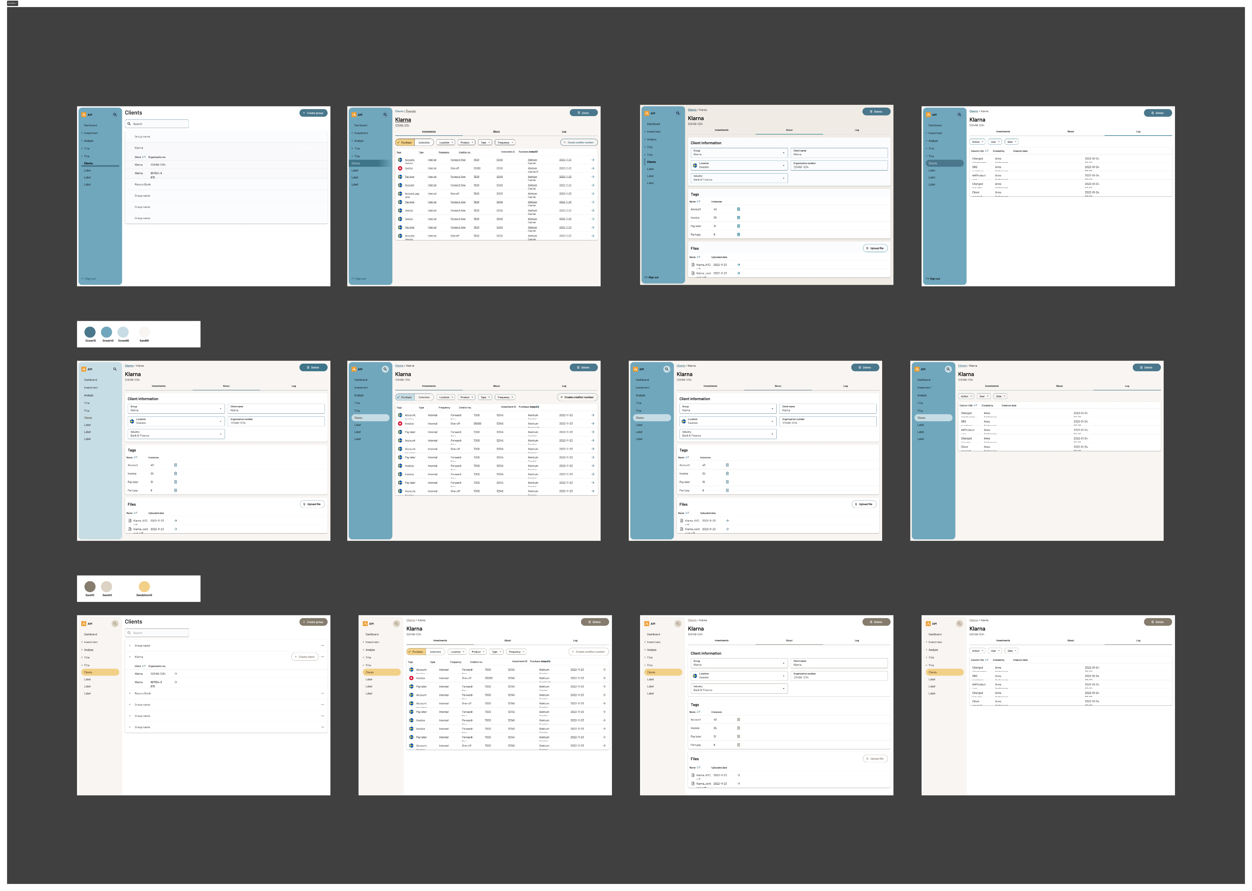
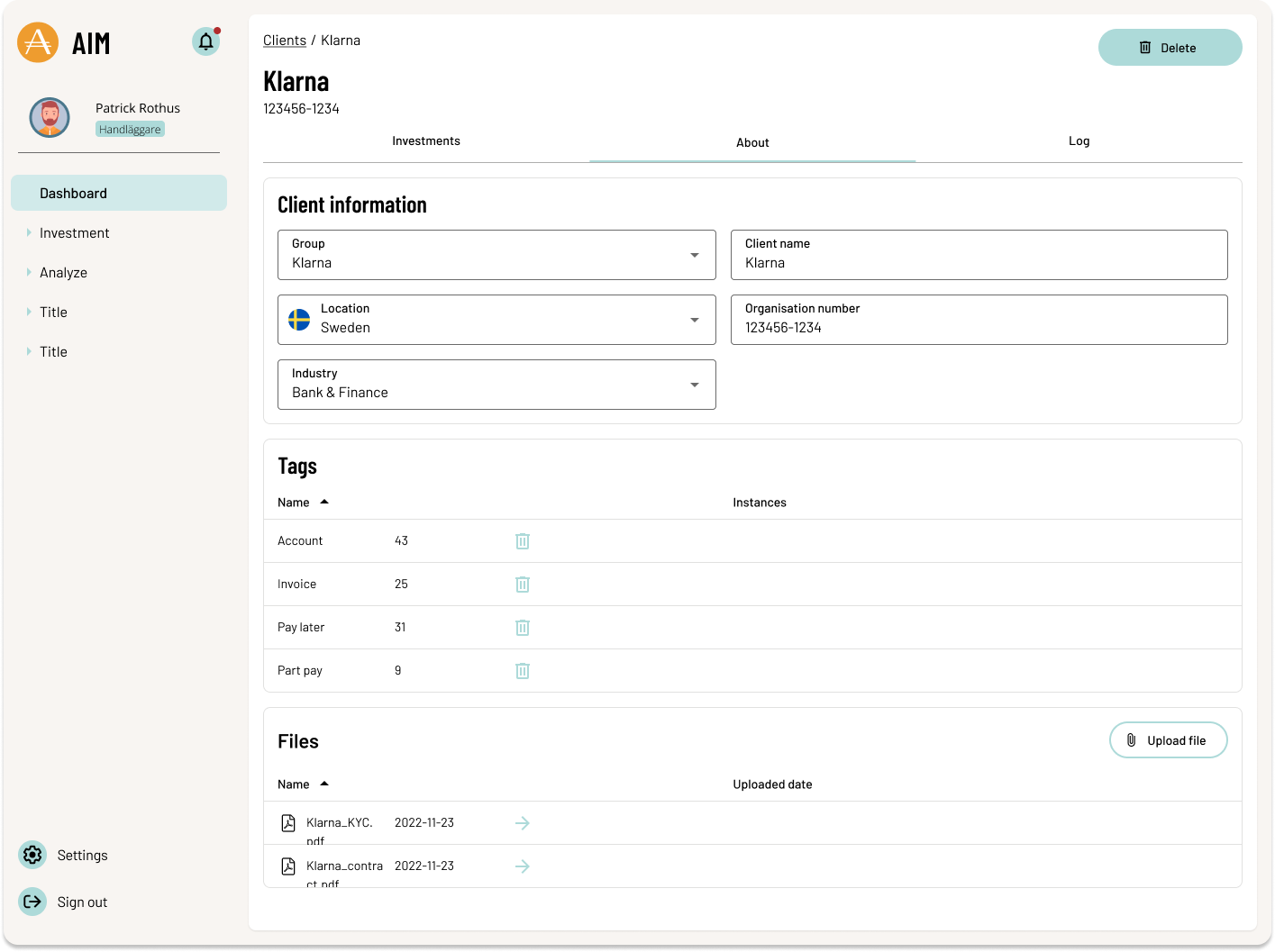
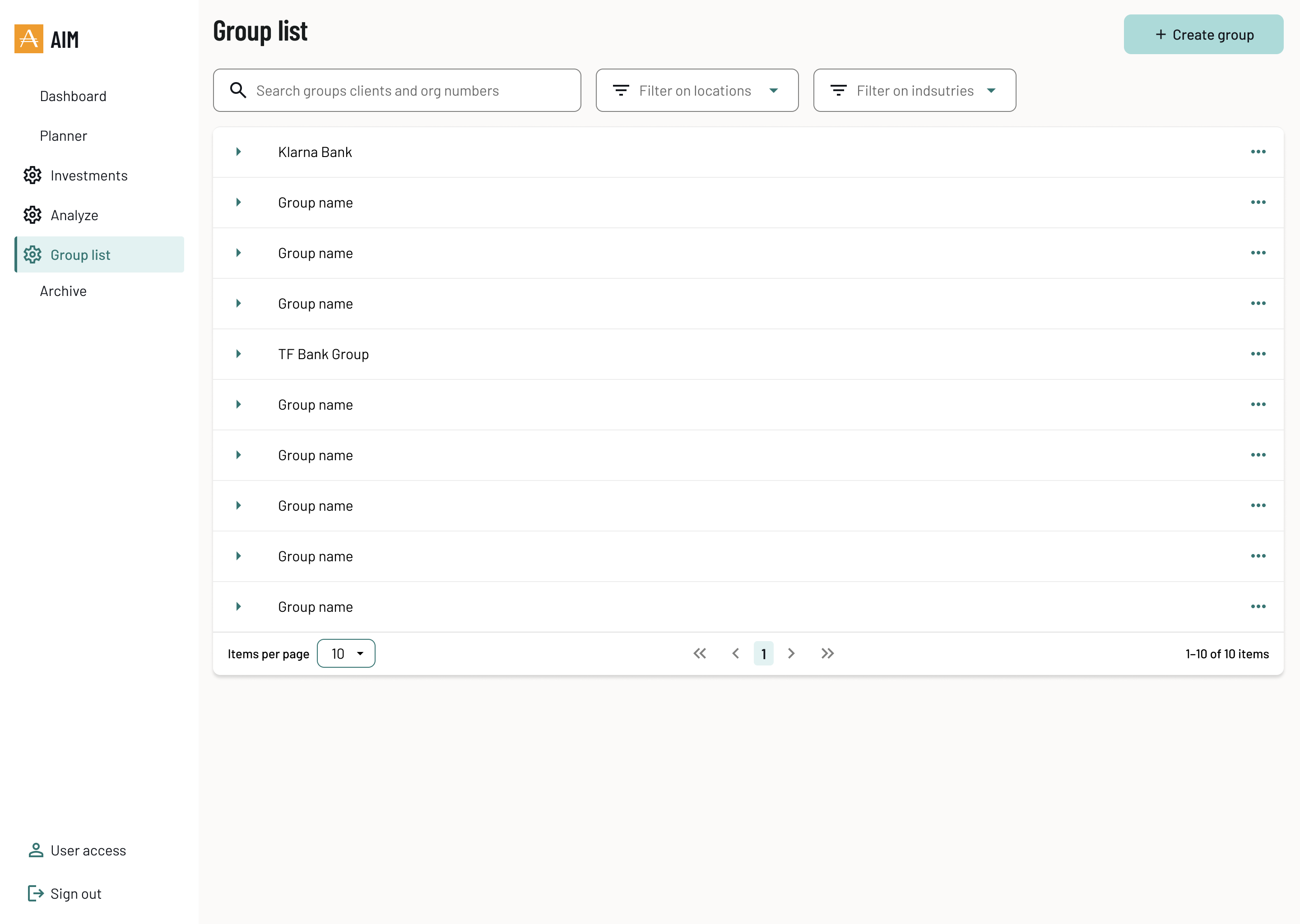
✅ Final OutcomeAfter several rounds of iteration, we landed on a final mockup that balanced brand identity, functionality, and user experience. 📸 Here’s the selected design:
Although this was the agreed outcome of our collaboration with the marketing team, the design process didn’t stop there. As we took full ownership of the product design, we continued to iterate, making smaller enhancements and refinements using the established primary, secondary, and tertiary color system. These adjustments allowed us to stay agile and responsive to user and business needs without deviating from the agreed visual foundation.
🔧 Additional Contributions
🧩 Creating a Component Library
I contributed to defining and documenting our core UI components, ensuring they were both flexible and consistent across different platforms. This library became a foundation for speeding up development and maintaining a unified look and feel.
📘 Establishing Design Guidelines
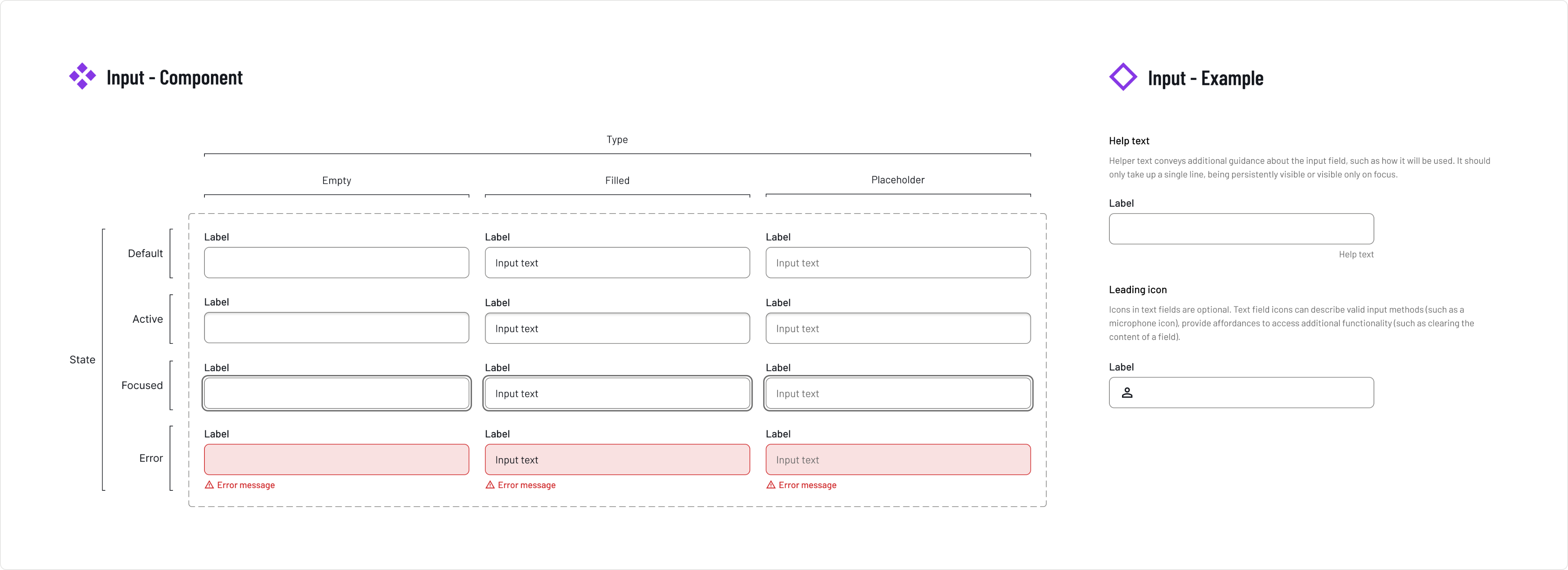
To support the component library and ensure consistent usage, I helped develop clear design guidelines. These included accessibility standards, interaction patterns, and best practices, giving our team a shared language and helping new contributors get up to speed quickly.
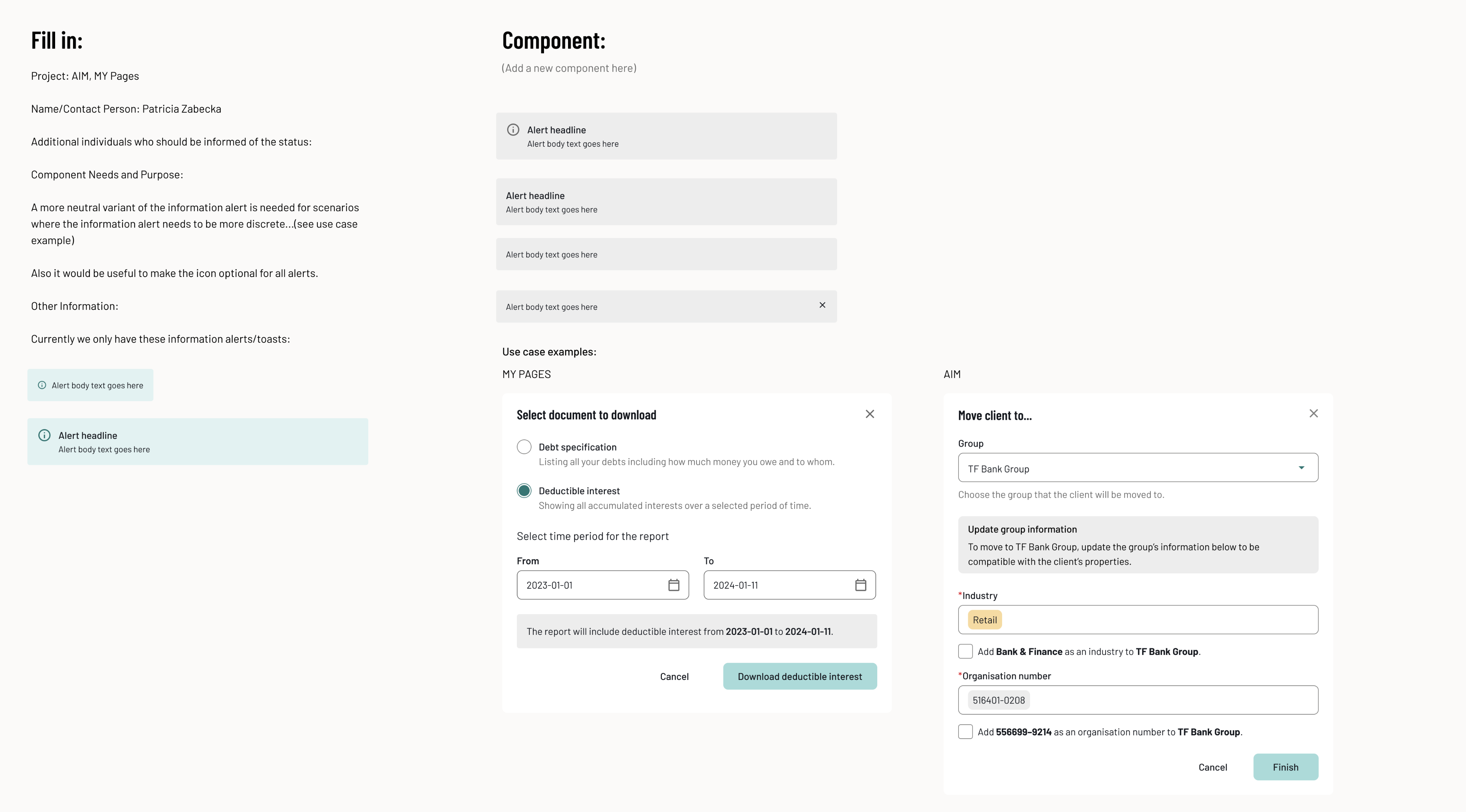
📸Below is a sample from the design system showing the Input component and the guidelines we created:
📂 Working with Structure
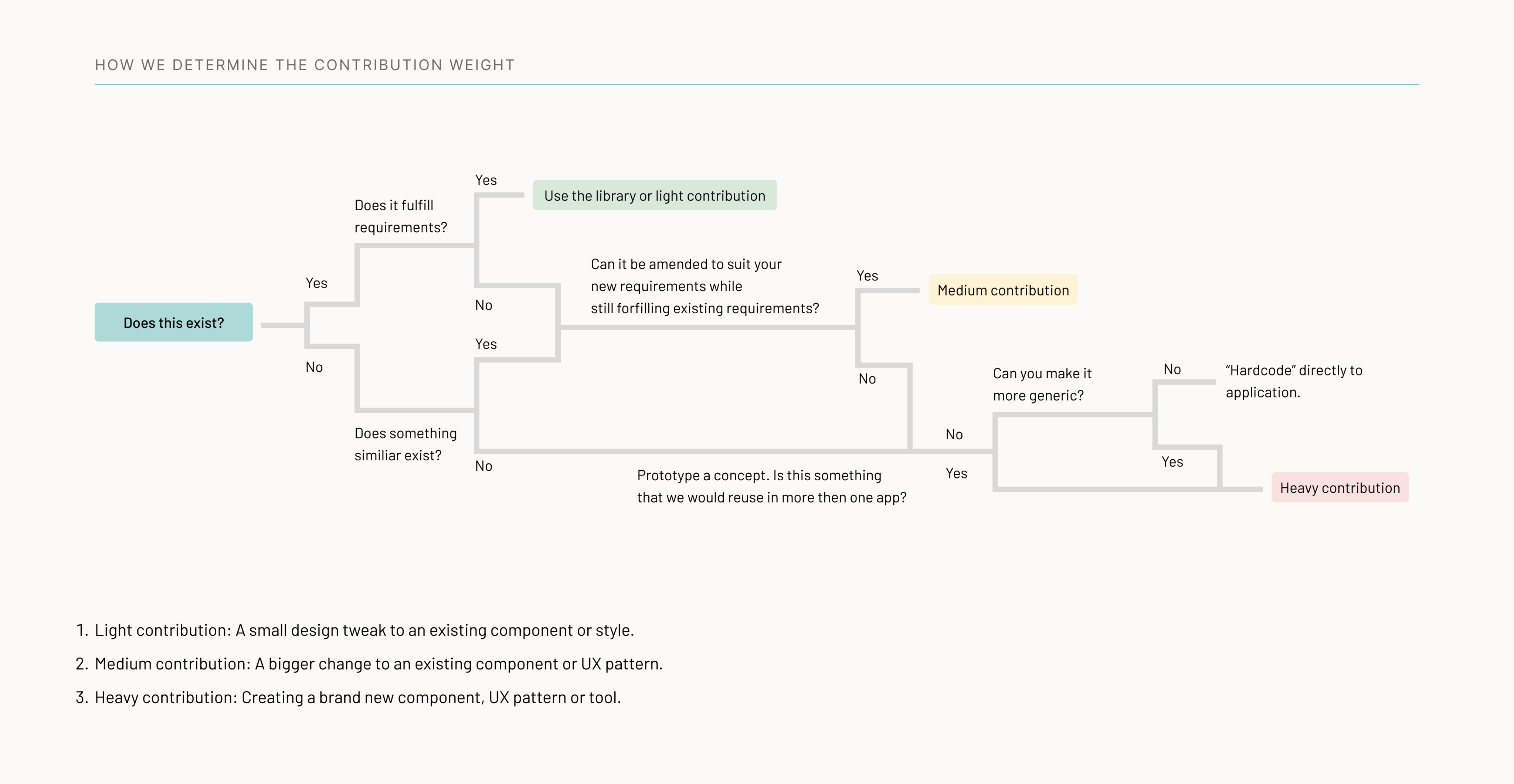
To stay aligned as a team and ensure a smooth workflow, we followed a documented design process and a clear set of instructions. These guided everything from early exploration to final delivery, keeping our work focused, collaborative, and consistent.
Using this structured method enabled us to work iteratively and asynchronously, giving everyone space to contribute at their own pace without needing to schedule unnecessary meetings. It supported faster feedback loops and made collaboration more efficient.
🗂️ Here’s a snapshot of the process we followed:
📄 And here’s an example of the instructions we worked from:
🔍 Below is a concrete example showing how we applied these steps in practice:
Result & Impact
- Increased efficiency – Designers can now reuse components, reducing design and development time.
- Consistency across products – A unified look and feel across products at Alektum Group, improving brand trust and usability.
- Improved accessibility – Standardized elements ensure a better experience for all users, including those with disabilities.
- Stronger collaboration – Clear documentation and guidelines improved alignment between design, product, engineering, and marketing teams.
Reflections & Next Steps
From my perspective, one of the key success factors was getting the marketing team engaged and involved early in the process. Their collaboration added real value to the final design system by aligning it closely with the company’s brand vision.
This early buy-in became especially important once we took full ownership of the design system. It allowed us to move forward confidently, without needing to constantly loop in marketing for approvals, streamlining both design and development.
From my experience, working with a design system is an incredibly valuable tool. It brings clarity, consistency, and efficiency to product design, and empowers teams to scale their work with confidence.
Implementing a design system was a crucial step in improving external services and internal tools. Moving forward, we aim to expand the system with additional components and continuing enhancing products.
Want to know more?


Establishing design system at
Redesigned an entire web-application, aligned with our new design system, resulting in an accessible, more efficient, and scalable product.
Background
As a UX Designer at a medium large company, I worked on improving the experience for internal and external users across multiple products. I noticed inconsistencies in the UI and UX across our products, leading to insufficient usability, inefficiencies in development and maintenance. Additionally, as we introduced new features it became clear that a structured, scalable design approach was needed.
Challanges
- Inconsistent UI elements across different products
- Lack of reusable components, making UI design and development inefficient
- Design and development teams working in silos, leading to misalignment
- A need for better accessibility and usability standards for all external products
Process & Implementation
To address these challenges, me and my UX colleagues played a key role in implementing our design system:
Working with the marketing team
Since branding consistency was essential, we collaborated closely with marketing to ensure that color choices and visual identity aligned with their guidelines. We worked from the existing Alektum Group brandbook to match a color set that fit Alektum’s established look and feel. This helped gain their support and ensured a seamless experience across our self-service portal and external communications.
Alektum brand colors
🎨 Building a Scalable Color SystemWe started with Alektum Group’s official brand colors and expanded them into a full scale, from shade 10 to 99. This gave us the flexibility to explore light and dark variants while staying true to the brand.
Alektum brand colors
🟢 🔴 🟡 Adding System FeedbackTo support user interactions, we introduced three basic status colors, keeping them functional yet aligned with the brand palette.
💬 Designing with EmotionFrom the brandbook, we were given a list of adjectives that define Alektum Group’s personality. These became our emotional design compass:
Flexible. Innovative. Knowledgeable. Quality-oriented. Helpful. Caring. Approachable. Modern. Down-to-earth. Informative. Warm.
We used these words to guide visual tone, typography, spacing, and interactions.
🖼️ Mockups in MotionUsing the extended palette, we created a series of mockups with different color combinations. These were presented to the marketing team in a collaborative workshop to gather feedback and spark discussion. 📸 The photo below shows just a small selection, over the course of the process, we created more than 100 mockup variations to explore the full potential of the brand palette.
✅ Final OutcomeAfter several rounds of iteration, we landed on a final mockup that balanced brand identity, functionality, and user experience. 📸 Here’s the selected design:
Although this was the agreed outcome of our collaboration with the marketing team, the design process didn’t stop there. As we took full ownership of the product design, we continued to iterate, making smaller enhancements and refinements using the established primary, secondary, and tertiary color system. These adjustments allowed us to stay agile and responsive to user and business needs without deviating from the agreed visual foundation.
🔧 Additional Contributions
🧩 Creating a Component Library
I contributed to defining and documenting our core UI components, ensuring they were both flexible and consistent across different platforms. This library became a foundation for speeding up development and maintaining a unified look and feel.
📘 Establishing Design Guidelines
To support the component library and ensure consistent usage, I helped develop clear design guidelines. These included accessibility standards, interaction patterns, and best practices, giving our team a shared language and helping new contributors get up to speed quickly.
📸Below is a sample from the design system showing the Input component and the guidelines we created:
📂 Working with Structure
To stay aligned as a team and ensure a smooth workflow, we followed a documented design process and a clear set of instructions. These guided everything from early exploration to final delivery, keeping our work focused, collaborative, and consistent.
Using this structured method enabled us to work iteratively and asynchronously, giving everyone space to contribute at their own pace without needing to schedule unnecessary meetings. It supported faster feedback loops and made collaboration more efficient.
🗂️ Here’s a snapshot of the process we followed:
📄 And here’s an example of the instructions we worked from:
🔍 Below is a concrete example showing how we applied these steps in practice:
Result & Impact
- Increased efficiency – Designers can now reuse components, reducing design and development time.
- Consistency across products – A unified look and feel across products at Alektum Group, improving brand trust and usability.
- Improved accessibility – Standardized elements ensure a better experience for all users, including those with disabilities.
- Stronger collaboration – Clear documentation and guidelines improved alignment between design, product, engineering, and marketing teams.
Reflections & Next Steps
From my perspective, one of the key success factors was getting the marketing team engaged and involved early in the process. Their collaboration added real value to the final design system by aligning it closely with the company’s brand vision.
This early buy-in became especially important once we took full ownership of the design system. It allowed us to move forward confidently, without needing to constantly loop in marketing for approvals, streamlining both design and development.
From my experience, working with a design system is an incredibly valuable tool. It brings clarity, consistency, and efficiency to product design, and empowers teams to scale their work with confidence.
Implementing a design system was a crucial step in improving external services and internal tools. Moving forward, we aim to expand the system with additional components and continuing enhancing products.
Want to know more?

